Figure ground
This picture is awesome and caught my eye , you tell me what you see and thats what makes it sucessfull.
Strong sense of type
yay Graffitti!!! this pic is awesome !! after a little bit of searching i found this legible piece of street art that twist typography in a very appealing way that is visually satisfying.
Monday, October 11, 2010
week 5
Strong contrast
This photo is very distinctive , you can tell the difference of the different elements and colors involved in the composition .
Strong sense of scale
this is a beautiful pic displaying a strong sense of scale. The small figure vs. the mountains of sand expands the compositions view causing it to me a would new world of detail.
Week 4 sample
Repetition
this is a awesome example of repetition . Frank millers"spirit" movie only repeats colors , Black ,Red and White and some yellows throughout the movie and art .
Pattern
this photo is very interesting in its pattern. the patterns are made of the glassy lines and strokes to make the accented triangle.
Saturday, October 9, 2010
week 3 samples
Primary line
This sick image is From my Graphic Tee line Social Xperiment !! this is a continuous line Drawing from my uncle Patrick kennedy, this is all one line and very detailed
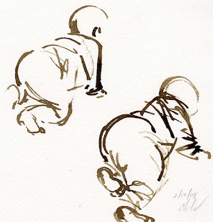
Primary shape
i feel this is a awesome primary shape drawing where you can really see within a few lines that its a baby, the artist made his point with limited detail and time
week 2 samples
Cliche
From a artist stand point this image or logo is very cliche. everywhere you hear or see peace this image pops up physically or psychologically.
Creepy
Im not a fan of I.C.P personally plus i hate clowns. This image is indeed creepy , thats not visually attractive to me. the design is cool but the intent behind it is to strike fear.
Creepy
Im not a fan of I.C.P personally plus i hate clowns. This image is indeed creepy , thats not visually attractive to me. the design is cool but the intent behind it is to strike fear.
Subscribe to:
Comments (Atom)


