Wednesday, December 8, 2010

week 13

This is a very popular web layout dominantly when myspace was really popular , its a simple interface that makes it easy to navigate and read.

This is a awesome organic interface that i never seen before and it instantly caught my eye. i also like the way the product was worked into the advertisement .

this city grid is a cool way to show the structure of the cites in a organized way. I like how it shows the uniqueness of all  the cities in their own design.
This is a awesome ad that caught my eyes in its decorative design.  it instantly ads character to the ad.
This san serif design is to the point and clean cut. the metal details and lighting makes this effective.
This classic serif font is also effective and to the point adding a little more softness to the message.

week 12

wow this an amazing display of too many colors in a very interesting way!!  The overload of colors really intensifies this pic to catch the viewers eyes. 

This picture is a good example of fewer colors caught in a picture most of the colors are repeated through the clouds which makes it a awesome scene of beauty.

Week 11

This picture is a awesome handwritten text!! the handwritten style adds character to the purpose represented also the fire is a nice touch!!

New York!!! alot of cars !!!! lights!!! excitement!!!! that all = dynamic movement!!!

week 10

I think public safety signs are the greatest example of plain and effective text .... plain and simple!!

This is awesome concept showing design but its purpose of giving information isnt effective because it cant be read.

week 9

this is a awesome chaotic picture !! I think this pic is a good example because there is allot going on in this scene and it conjures up alot of  questions.

i like the architecture of this structured home , even though its a unusual design but its not too far off to me chaotic .

week 8

this picture of the grand canyon is a definite eye opener when it comes to wide open spaces , the perspective of the picture is amassing and shoes foreground, middle and back.

I fell very bad for this dog i know hes upset haha but i picked this picture because it displays the cluttering  space and how uncomfortable it is .

Week 7

this sculpture by henry moor is awesome and the photo shows a great example of strong contrast value . The way this is displayed is how the white shines out and differs from the dark background .
this picture exhibits great texture because the viewer can simulate the feeling in their mind making the pic a great composition.

Monday, October 11, 2010

week 6

Figure ground

This picture is awesome and caught my eye , you tell me what you see and thats what makes it sucessfull.

Strong sense of type

yay Graffitti!!! this pic is awesome !! after a little bit of searching i found this legible piece of street art that twist typography in a very appealing way that is visually satisfying.

week 5

Strong contrast

This photo is very distinctive , you can tell the difference of the different elements and colors involved in the composition .

Strong sense of scale

this is a beautiful pic  displaying a strong sense of scale. The small figure vs. the mountains of sand expands the compositions view causing it to me a would new world of detail.

Week 4 sample

Repetition

 this is a awesome example of repetition . Frank millers"spirit" movie only repeats colors , Black ,Red and White and some yellows throughout the movie and art .

Pattern
this photo is very interesting in its pattern. the patterns are made of the glassy lines and strokes to make the accented triangle.

Saturday, October 9, 2010

week 3 samples

Primary line
This sick image is From my Graphic Tee line Social Xperiment !! this is a continuous line Drawing from my uncle Patrick kennedy, this is all one line and very detailed

Primary shape
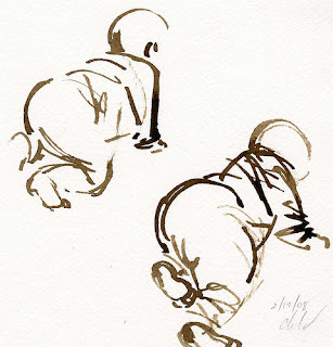
i feel this is a awesome primary shape drawing where you can really see within a few lines that its  a baby, the artist made his point with limited detail and time

week 2 samples

Cliche

From a artist stand point this image or logo is very cliche. everywhere you hear or see peace this image pops up physically or psychologically.


Creepy

 Im not a fan of  I.C.P personally plus i hate clowns. This image is indeed creepy , thats not visually attractive to me. the design is cool but the intent behind it is to strike fear.

Tuesday, September 7, 2010

2D design project of inspiring and uninspiring pictures


This pic here is very inspiring to me ! I am a former sponsored skateboarder and to be at a level or expertise as Zared Bassett is greatness! This picture makes me want to get better quick to reach this level of freedom.
This Crap here is uninspiring ! not the entertainer T-pain but the ridiculous chain he has on, this doesnt inspire me to get one . it makes me think of the lack of priorities the present.

Wednesday, July 28, 2010

Taggin Bmore city


This was funny and i feel that ima get into it alot more !!

Monday, March 22, 2010

Spring semester work

Hey its been a while since i put some quality stuff up but heres alil something

Tuesday, January 5, 2010

early pencil drawings

these are my recent sketches ive done , over thr course of time this spot will be packed with work